

OVERVIEW_
A Stetson company rebrand.
DESIGN_
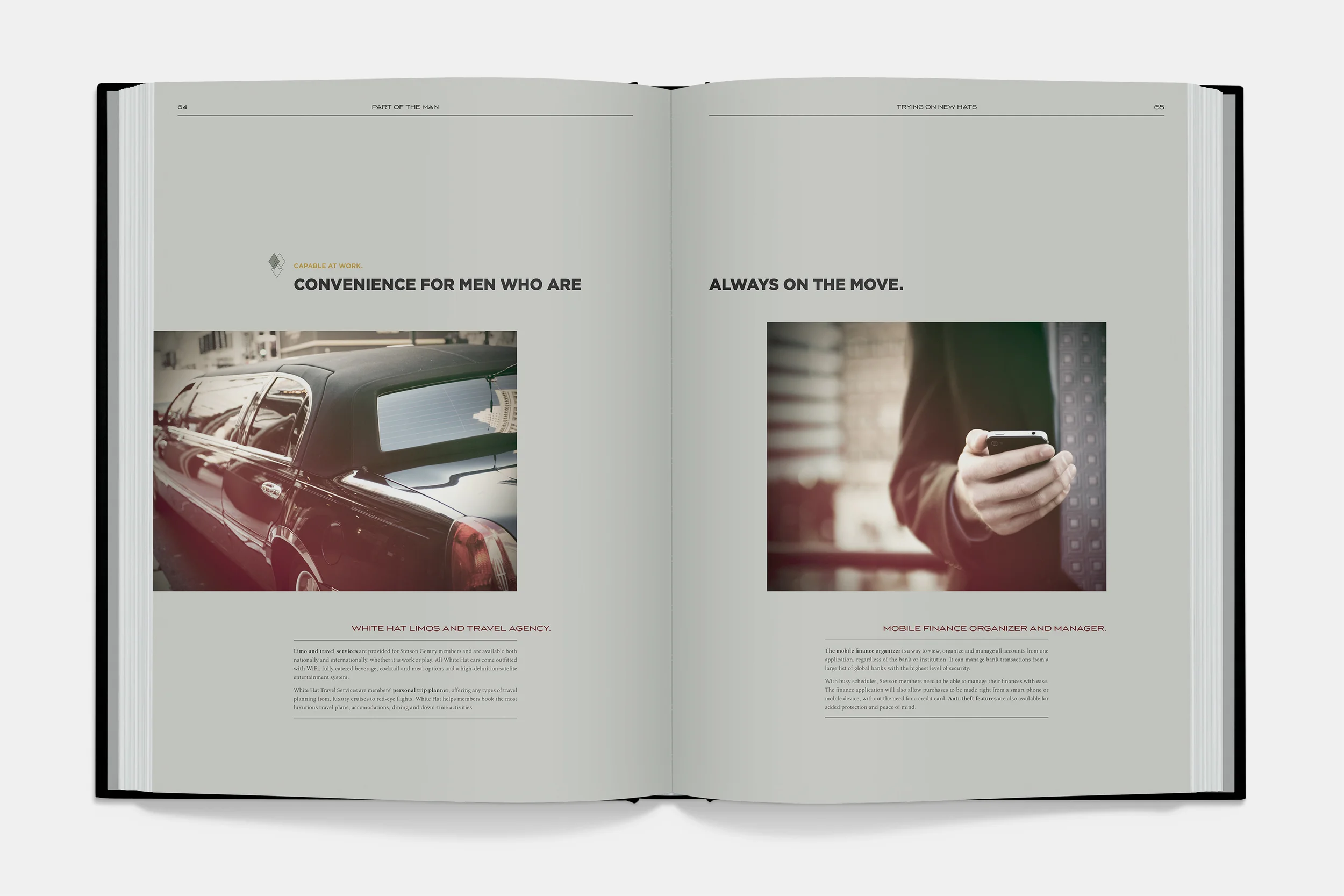
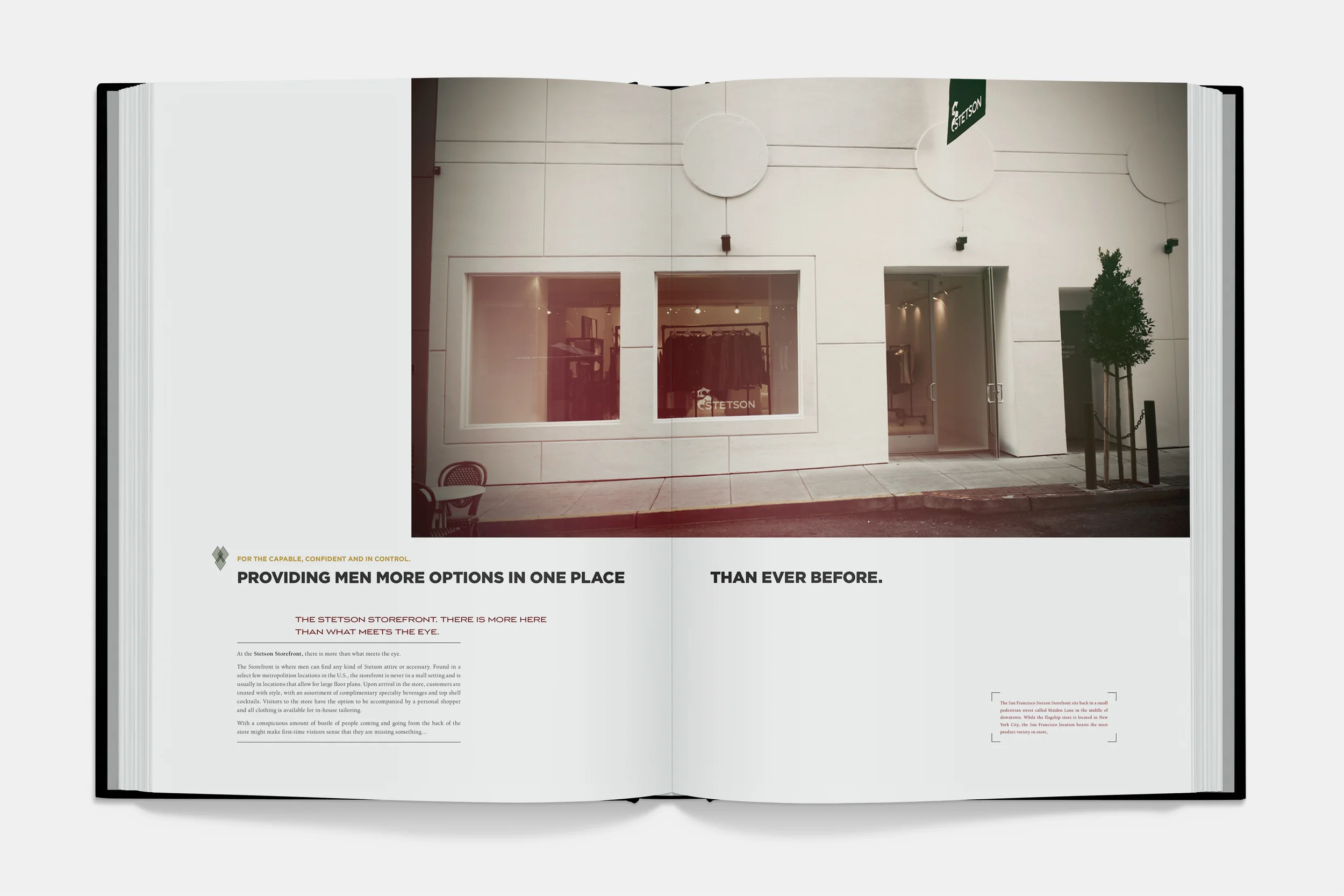
Stetson’s current reliance on the rugged American persona has limited its potential and their products have become convoluted and unoriginal. The was to reestablish Stetson’s strong sense of identity for the modern man and expand the line of products in their repertoire. Capable, confident and in control are qualities defined as the keywords for the new brand. Targeting men on the way up, Stetson doesn’t question how you get there. Stetson walks the line between a white hat, black hat mentality. The end result is a brand with both edge and sophistication. Stetson no longer sells hats; it sells services and a lifestyle for those who can afford it.
RECOGNITION_
2011 Brand New Awards Winner for Comprehensive Identity Design and Brand Guidelines
Visual Design, Identity Design, Photography

THE STETSON SPUR_
The new logo was inspired by Blackletter type and the edges of cowboy boot spurs. The intention of the design was to create a sturdy mark that appeared both elegant and rough around the edges, communicating the multi-faceted nature of modern Stetson men. While paying homage to the cowboy, the new mark’s sharp and bold features showcase the more refined qualities of the rejuvenated brand.
